Identity Design for The Abbey at Chesters
Brief: Create a strong identity for The Abbey at Chesters, a restaurant in the Swan Valley, Western Australia. It offers Belgian beers, great food and Heafod Glen wines in a relaxed environment with professional and friendly service.
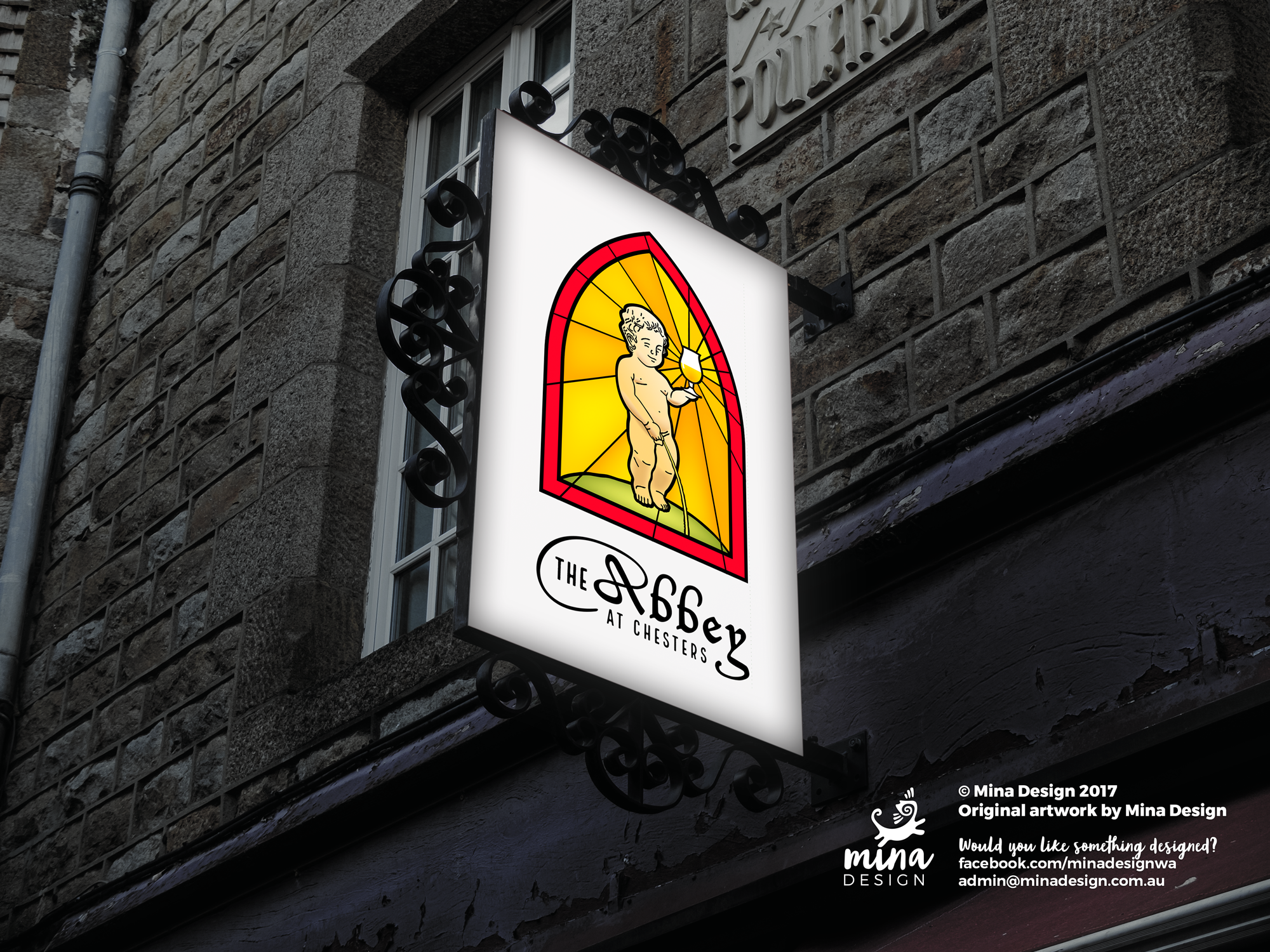
I was given free reign, besides to create a vector illustration of the Manneken Pis holding a beer. This was a great opportunity to do some intense research and development. I looked into the identity systems of their local competition, historical images of abbeys (especially in Belgium and surrounds) and the general feel of that era.
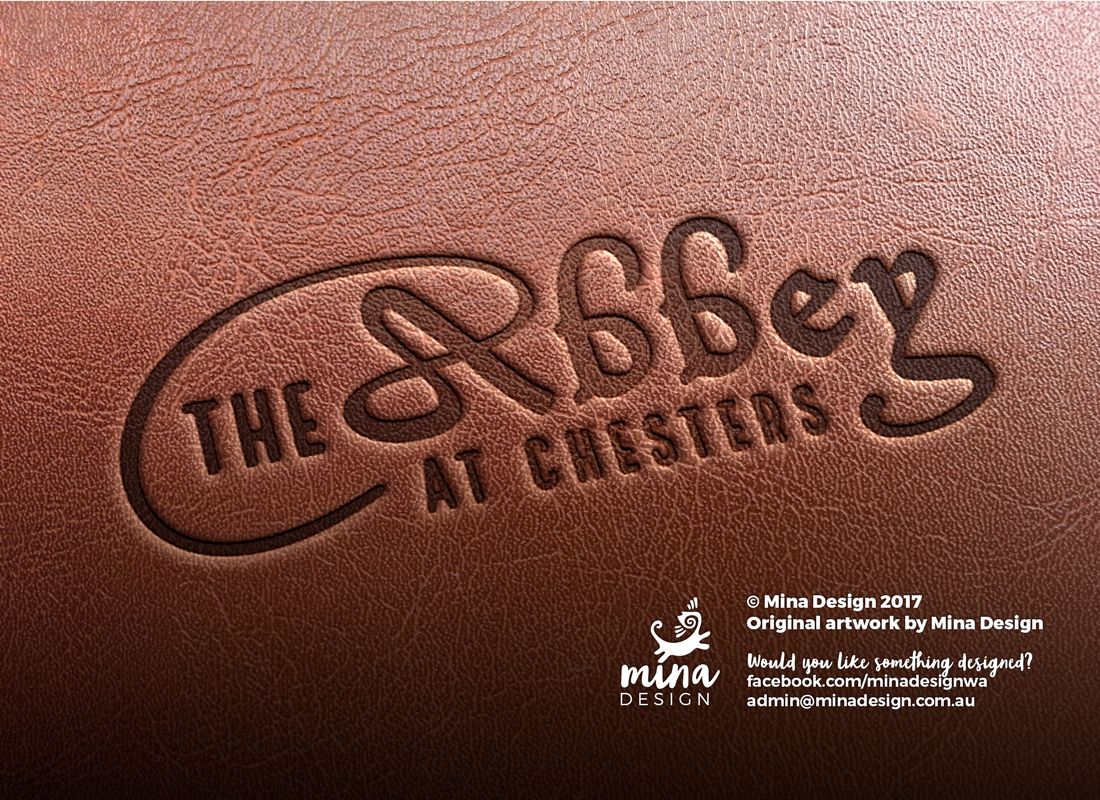
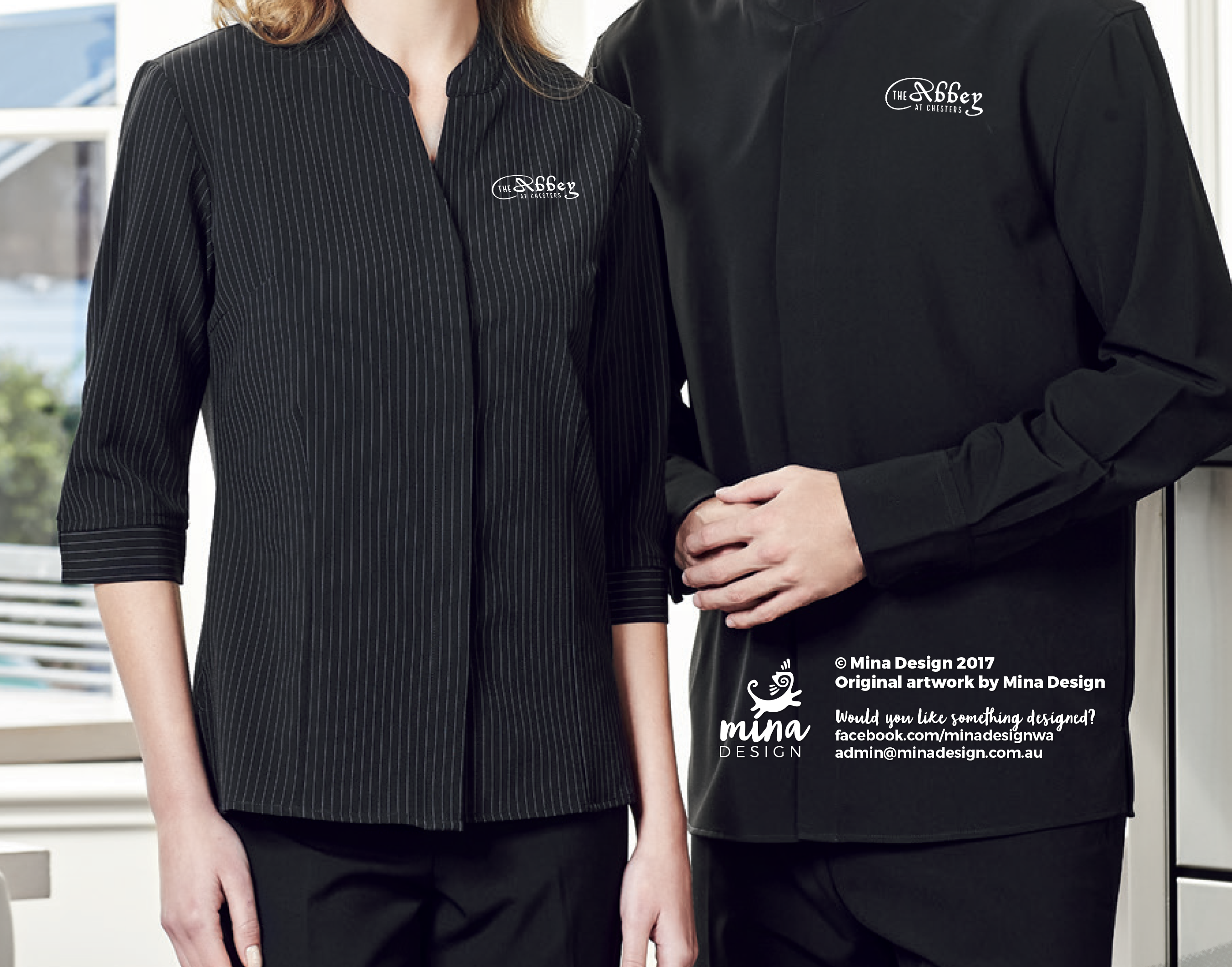
After hours of research I found several unique typefaces that had Dutch/Belgian/French roots. I combined them with some more modern hipster fonts to reflect the dual nature of The Abbey at Chesters – a mix of modern Australian and ancient abbey. The result is a unique identity system which reflects The Abbey’s promise of casual, family Australian dining with a Belgian twist.
The result of extensive research and development was a stained glass style icon complete with hand-drawn vector Manneken Pis, full of personality. Underneath contains the business name – a logo in its own right – which is strong enough to be used independently of the icon.
